
Text on images does real work: the price on a product shot, “SOLD” over a listing, a name on an event photo, the caption that makes a meme a meme. And the difference between text that reads and text that disappears is about three decisions — placement, contrast, and weight.
This guide covers the mechanics with our add text tool, then the three decisions in detail — including the placement mistake that ruins most captions on the first try.

How to Add Text to a Photo Online Free (3 Steps)
- Add the photo. Drop the image into the Add Text to Image tool. The editing runs locally in your browser — the photo never leaves your device.
- Type and place. Write your text, then drag it into position. Adjust font, size, and color until it sits right; the live preview shows exactly what downloads.
- Apply and download. The text is rendered into the image at full resolution — same dimensions, now with your words baked in.
The Readability Recipe
Caption guides converge on the same three settings, whether it’s a social caption or a meme: bold fonts win — thin type evaporates on busy backgrounds (it’s why meme culture standardized on Impact); contrast carries — white text with a dark outline or shadow reads on almost anything; and short beats clever — five words at a readable size beat fifteen at a size nobody can parse on a phone.
| Job | Font choice | Where it goes |
|---|---|---|
| Meme / funny caption | Bold impact-style, all caps | Top or bottom band, centered |
| Product info (price, size) | Clean bold sans-serif | Empty corner, away from the product |
| Status stamp (SOLD, DRAFT) | Heavy caps, semi-transparent | Diagonal across the middle |
| Event / name label | Medium weight, high contrast | Bottom strip or name-tag zone |
Placement: The Quiet-Corner Rule
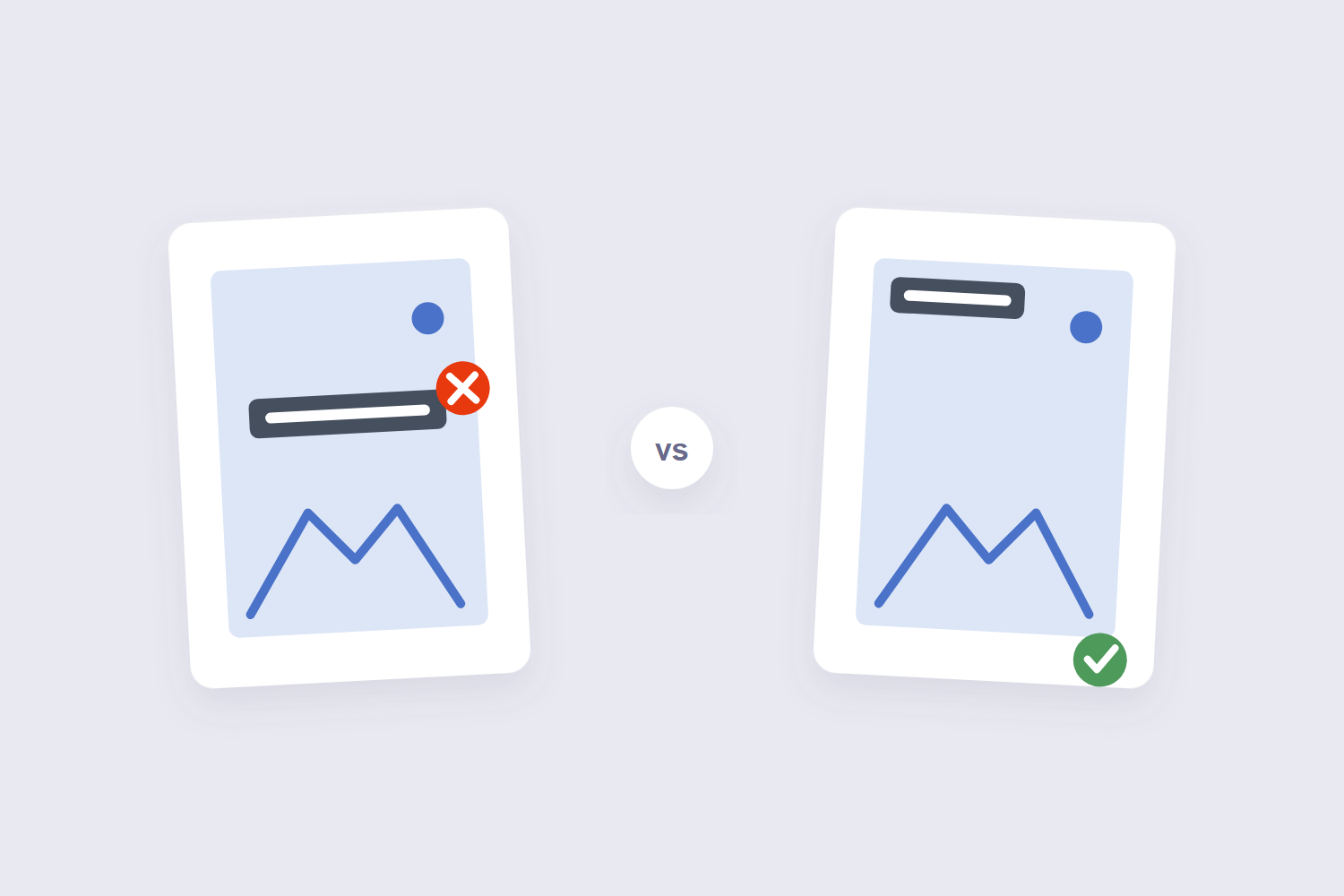
The first-draft mistake is universal: text lands on the busiest part of the photo, right where the detail lives. The fix is to place text where the image is boring — sky, walls, blurred backgrounds, empty foreground. Readability guides like Pixelixe’s photo-text primer frame it the same way: don’t fight the photo, use its quiet zones.
If the text must sit on a busy area, manufacture contrast instead of hunting for quiet: add a semi-transparent bar behind the text, or use the outline/shadow effect. Both are honest techniques — the text stays readable, the photo stays visible underneath.

Four Jobs Text-on-Image Does
Beyond memes, stamped text solves recurring chores. Marketplace listings: price and condition on the photo survive screenshots that crop out descriptions. Event photos: names and dates so the image stays meaningful when it circulates without context. Announcements: a photo with “CLOSED MONDAYS” travels further than a caption that separates. And simple protection: a visible name across client proofs makes casual reuse awkward — the same principle as PDF watermarking, applied to photos.
Frequently Asked Questions
Is the text editable after I download the image?
No — the text is rendered into the pixels. Keep the original photo and your caption text somewhere; re-adding it takes thirty seconds if you need a change.
What font size works on social media?
Bigger than feels necessary on a desktop screen. Phone feeds display images small — if you can read the text comfortably at thumbnail size on your own phone, it’s right.
Does adding text reduce image quality?
The underlying photo keeps its resolution — the text renders at full size on top. The only quality risk is exporting to a heavily compressed format afterward; JPG at 85%+ keeps everything crisp.
Can I add text to a PNG with transparency?
Yes — the tool preserves the format’s characteristics, so transparent areas stay transparent with your text over them. That’s the standard way to label logos and overlay graphics.
Is this safe for private photos?
The tool processes everything in your browser — the photo never uploads to any server. That’s the version to use for anything personal.
Can I use it to make memes?
That’s practically its second job — type in bold caps, place top or bottom, done. For meme fonts specifically, a bold sans-serif or impact-style font from the tool’s options gets the look.
Quiet corner, bold type, contrast for days. If the finished image is headed into a document or a printable set, the image to PDF tool assembles it — and the JPG to PDF guide covers that flow.
